GO WELL STAY WELL
Blog
Heart-Centred?
If you came here via my homepage, you’ll have seen that I describe what I do as ‘heart-centred, science-led coaching for women’. Since it’s February - which holds both Valentine’s Day and International Hearth Month - I thought I’d unpack this concept a little more so that you can get to know me/Go Well Stay Well a little better.
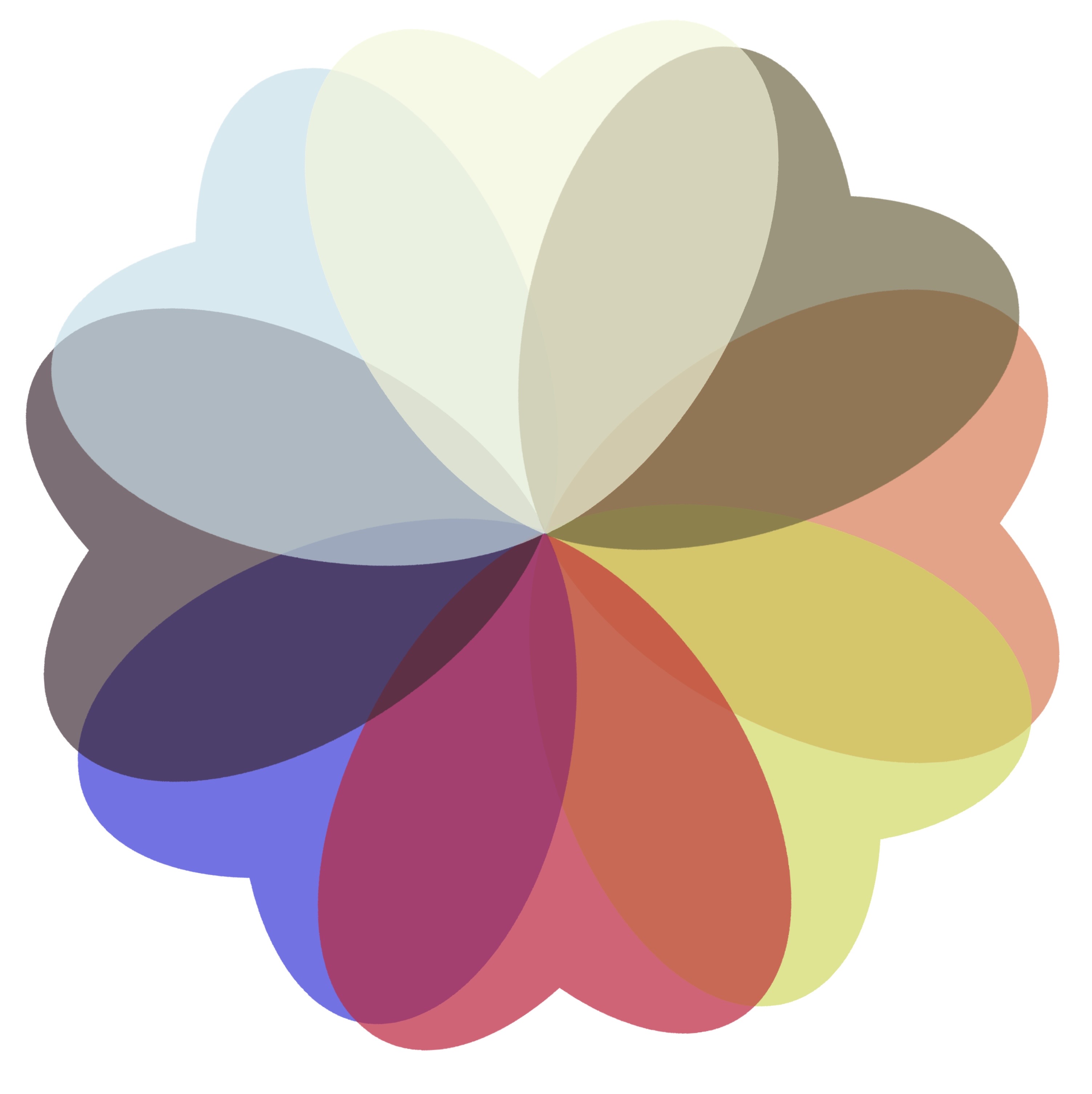
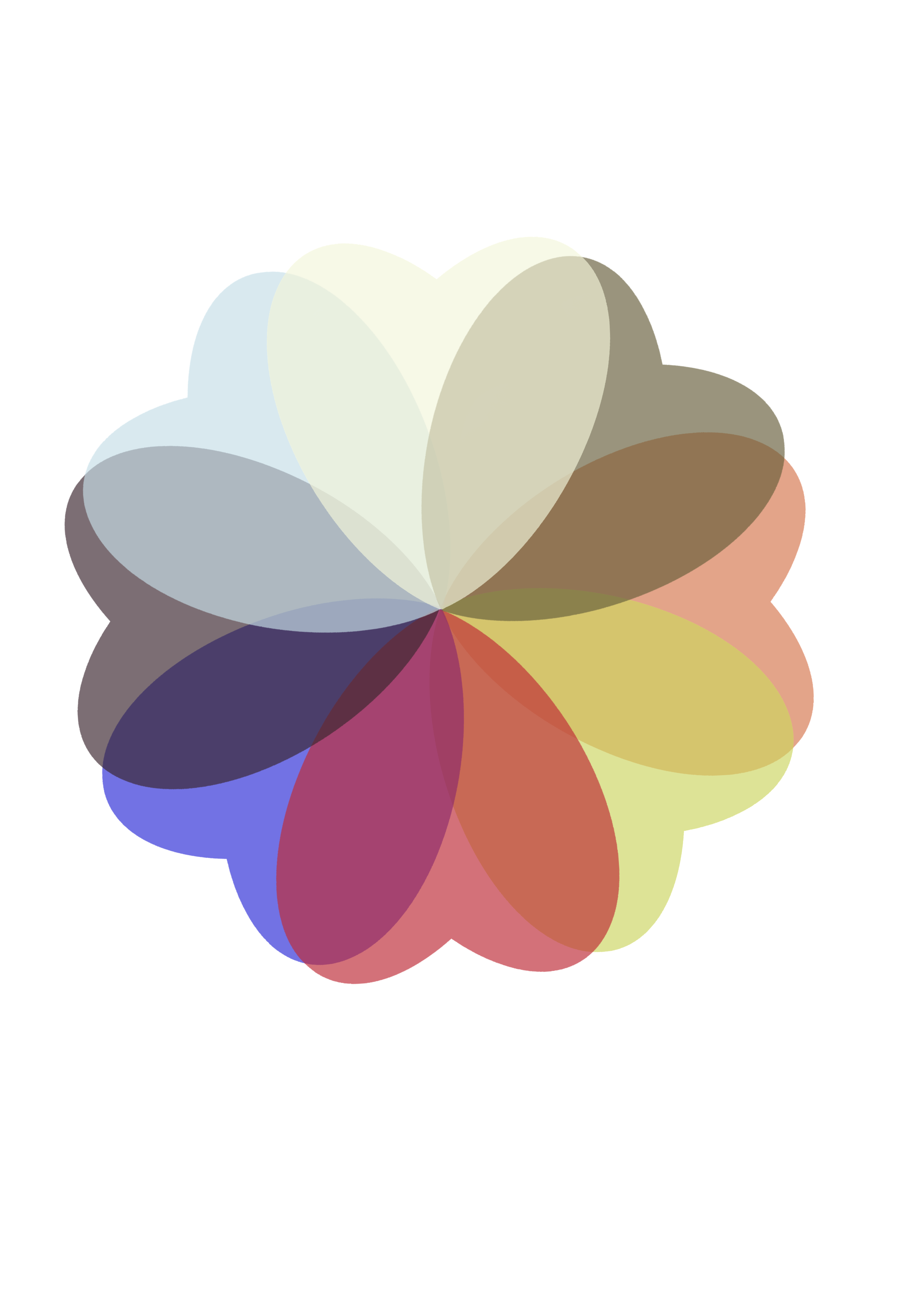
The Go Well Stay Well Logo design
A circle of eight hearts, each in a different colour, to represent different aspects of health and wellbeing, and each overlapping, to capture the connected but diverse nature of holistic wellness: what works for one woman may not necessary be the most effective focus for another.
The design brief
My logo was created by my daughter-in-law, Cat. She understood the brief!
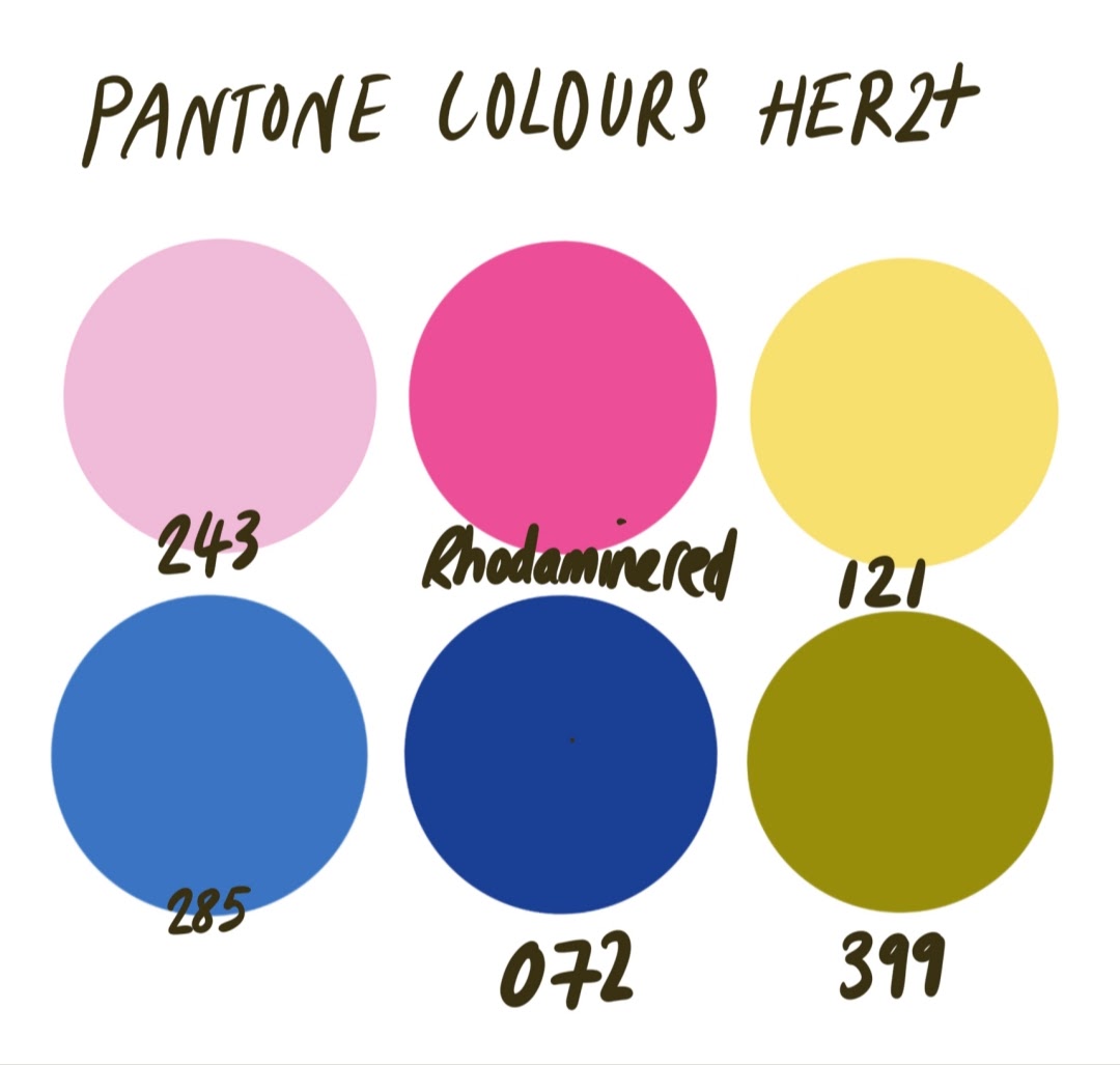
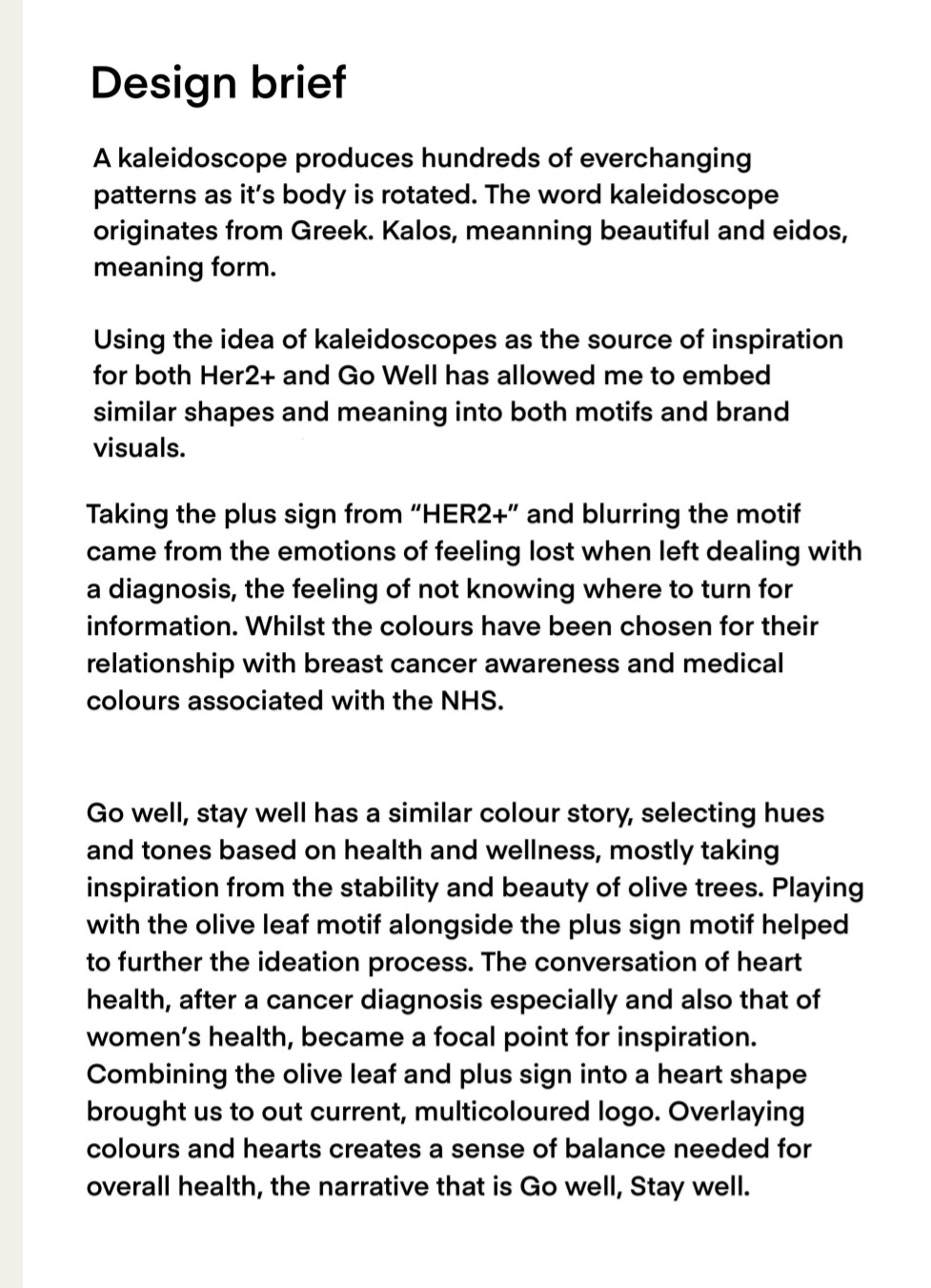
We started with a design for another project that I’ve got running in the background, connected to my experience of HER2+ breast cancer in 2021-22. For that project, I had asked Cat for something colourful and kaleidoscope-influenced.
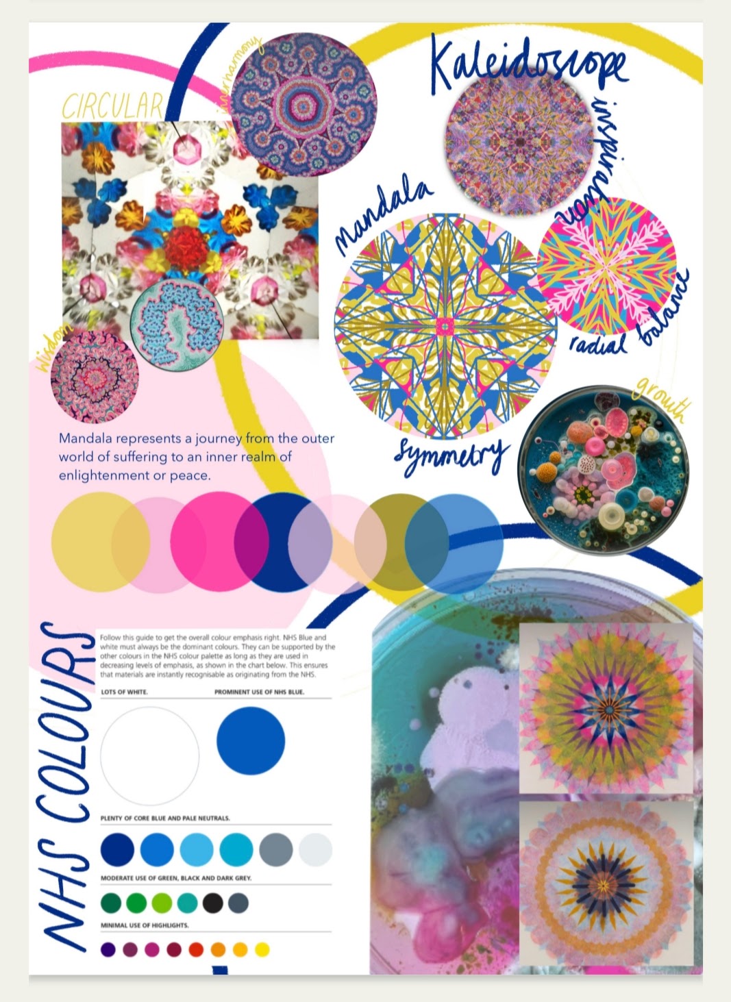
I love kaleidoscopes. Always have, since I was very young. They were a staple of my early-years’ Christmas stockings and I can still recall the thrill of looking into the eyepiece after each new twist and tweak of the barrel. I was enthralled by the gorgeous patterns and fabulous colours and their seemingly infinite variety.
Now, I see kaleidoscopes as representing something both scientific (invented in St Andrews) and magical, and I especially like the fact that they are all about shifts in perspective.
So, in essence, the kaleidoscope motif represents: science + magic (hope/luck?) + perspective.
These three elements underpin my HER2+ project, called HER2 Positivity, in which I share the positives of my diagnosis and treatment in order to provide hope and encouragement to others who find themselves with a similar ordeal ahead of them. (HER2+is not a very common breast cancer - only about 15% of all BC diagnoses - so it can be hard to come by useful, usable and uplifting content, as I discovered.)
My coaching business, Go Well Stay Well, was created as a result of my health reboot after HER2+, so I wanted design elements from HER 2 Positivity to inform Go Well Stay Well’s identity. Cat’s notes from her design brief, below, capture our conversation and direction perfectly:
The Circle of Hearts Motif
The hearts are in a circle to represent a community of women. Women supporting women, women sharing their wisdom and experience to lift others.
And the heart is my main motif because heart disease is the single biggest mortality risk to women. As someone who has had cancer, I am also more likely to die of heart disease than I am from a cancer recurrence. That’s partly to do with my radiotherapy treatment, which can reduce perfusion through blocked arteries or damaged valves, and partly to do with the impact of my chemotherapy and targeted therapies, both of which are punishing to the muscle and health of the heart.
So, a circle of eight interlocking/overlapping hearts.
Why 8? Let’s play with that a little...
The Number 8
I am not great with ‘woo woo’ - more through lack of self-confidence and comfort than any contempt. I just don’t feel cool enough or knowledgeable enough for the more mystical end of the spectrum, but I’ve rarely met someone spiritual / into numerology / able to interpret Tarot / pin down Enneagrams / figure out astrology / that I wasn’t at least beguiled by. It’s all very intriguing, the ascribing of meaning, don’t you think?
I get it. And also I really don’t get it.
And I say that as a Chinese Green Woodsnake, Scorpio, INFP, Enneagram 7… (Or was it 6?)
So, the 8? Well, it’s a lovely, balanced, ‘complete’ symbol. And then there’s any of (and also none of) the following reasons:
In Pythagorean numerology: victory, prosperity and overcoming
Auspicious for Buddhists
Used In Islamic symbology
Lucky in Chinese and other Asian cultures
In numerology, it’s the number of building and, in some theories, the number of destruction
In Druidry, there are eight festivals - 4 lunar and 4 solar.
And the colours?
Well, firstly, aren’t they just delicious?! Cat and colours is a whole thing. She is brilliant at colour. And these ones, for me, represent the following:
Papyrus - the pale, parchment off-white. Paper, velum, wisdom, the Classics and - within a wellness focus: the brain
Olive - the grey/green. Peace, hope, life, resilience, ageing, support. And - for my wellness content - legacy.
Burnt Orange - the sun’s heat. Mindset.
Pear - the palest, sharpest green. Nutrition.
Flag Red - the heart, natch :)
Deep Blue - Mediterranean, NHS-inspired, health, knowledge, compassion. For me? Risk and Rewards.
Dark Plum - the most delicious shade, a deep and luxurious pink-noir. For Go Well Stay Well, this is a core brand colour but, in my wellness content, it represents rest and sleep
Pale Blue - another core brand colour, but this soothing shade also represents bone and muscle - the unseen and, too-often unsung, heroes of your metabolism.
So, there you have it. The meaning behind the Go Well Stay Well logo. Now that you know just how much thought went into it, just imagine how much effort I put into my resources and my coaching!

More
Interested in what I offer, but not sure where to start? Download my free GWSW Wellness Wheel resource to figure out your first step.
Feeling overwhelmed with all the content on social media? Read this blog post on Reclaiming your Agency from the algorithm and then download my free 10-Minute Reset.
-
Want a quick chat about any of this? Or want to make a comment or suggestion? Here’s how to connect with me.
Chat via the ‘chat’ button on my website at any time. (Bottom right hand corner.)
Send me your questions, suggestions, or comments by email.
Want to work with me? You can explore my coaching options or…
Register for my f webinars by clicking on the links below.
7pm 22 February: Heart
7pm 29 March: Health Risks and Rewards
7pm 26 April: Bone & Muscle
7pm 31 May: Brain
7pm 28 June: Nutrition
7pm 26 July: Age & Stage I (30s and 40s)
7pm 30 August: Age & Stage II (50s and 60s)
7pm 27 September: Mindset
7pm 25 October: Sleep
TBC November: Legacy
December: no workshop.
To see more of Cat’s design work, go to her website, catwatsonart.com or Instagram, @catwatsonart
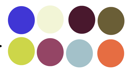
An earlier version of the Go Well Stay Well colour palette. We switched out the Row 2 purple for red.
Want even more? More info, more inspo?
If you'd like more of this, I send out my emails fortnightly-ish